Friday, 28 September 2012

Typography experiments: part 3

example of Ruscha's work.


These examples were inspired by an artist called  Ed Ruscha creating typography. The artist looks like he then goes and digitally enhances the images on photoshop. I then decided to have a go myself using food materials such as salt,sugar,spaghetti,beans,ketchup and pasta. I found it really easy working with the material like ketchup and salt, and it is easy to get it in the exact place you want it, other material like pasta, as it is hard, it is a bit more difficult to create the exact you may have wanted for instance, small floaty text, in the end, we chose quite a standard font to use. Whilst thinking about the text we always made sure that our typography always related back to our material such as using ketchup, we wrote out the word splat!

I really enjoyed working this way as I have always preferred handmade as you have more more control on the outcome. To go back and develop this further I would take this original images and then edit them into Photoshop to give a more sleek effect looking much more like Ed Ruscha's work.

Kinectic Typography

An example of Heebok Lee's work

For today's lesson we look at a typography artist called Heebok Lee who is a title sequence designer. In this case we looked one his video called sky words. http://www.youtube.com/watch?v=593GOFEPrsQ

We discussed how he created the texts and the different effects such as fade in and out and text zooming in and out. I was then inspired to create my own stills similar to Lee's work using Illustrator.


I create these text on illustrator by using the character, type and transparency pallet.
TEXT = Gill Sans>regular>size260>arrange your size>effect>blur>guassain blur>15.

BUT SURE THE SKY IS BIG = Georgia regular>size36>type text>rewrite last word>increase size>effect>warp>bulge.
SOMEHOW STOP = adjust text>effect>blur>radial blur>zoom selected>best>27>47>ok.

BIG = type text>distort and transform>pucker and bloat>15>ok.

From this tutorial, i enjoyed experimenting with the different effects but found it difficult to adjust as i'm used to working with Photoshop. In the future I am going to have to practice in order to improve my Illustrator skills. 


Sunday, 23 September 2012

M & M Paris - Typography.

examples of M&M Paris work 
Effect done by hand

Effect done by Photoshop

This work has been inspired by an artist  M&M Paris.The artist uses images to create the out lines of words, after looking at the artist work we were inspired to do our own handmade and digitally. 

For the hand effect, I have cut out letters of black card and then placed an image of myself that I had earlier taken on Photobooth and put into black and white.
 For the digital experiment, i took the same photograph, changed it to black and white and adjusted the brightness and contrast settings. After I had done this I went and used the threshold effect in photoshop to give it this extreme black on white. I then opened a new layer, type the letter I wanted out very large, I then merged the two layers together, and hid the bottom one, exposing only the image in the letter shape. To make the image look more in the style of M&M Paris, I got my brush and made some dripping effect.
This time I preferred using Photoshop rather than handmade because I got a much more professional finish, and more the same style of M&M Paris, the handmade didn't look quite so well in my opinion and in the future I would  use the digital technique again.

Watercolour Typography

example of artist work


The hand water colour based work was inspired by an Japanese artist called Natsuki Otani, who draws out her letters in pencil, to then go on and fill the colour in water. Once that is done you drip on the water colour in the selected places you want it to be and the more colours you put on the more blending effect you have. After it has been left to dry, you rub out the pencil lines you made earlier. My pencil lines didn't come off very easily as i had painted over most of those so my pencil lines are still visible, if i was to do this process again i would be more careful with my lines and the paint.

The second one is a water colour based image created on Photoshop. You use soft brush tools with pale colours, and download (optional) a textural text to give a water colour effect. The tools involved are magic wand tool, brush tool and the select tool; also working with your colours, opacity and flow. 

Overall, I think I prefer the hand water colour image as it gives a much more bold effect than the Photoshop one. It also looks more realistic. Also, doing this effect by hand you have less control on the end result therefore if something doesn't go to plan, but it gives an interesting effect. You wouldn't get that with Photoshop. Alternatively, using the Photoshop technique, if something goes wrong you can just undo it where as with the hand technique you either work with it or it is ruined. 

Monday, 17 September 2012

Typoography Unit - Indepth Analysis - Hennie Haworth

examples of artists work
another example of haworth's work

Hennie Haworth's is a freelance illustrator. She studied at the university of Brighton and now lives in London.She now works with clients such as; Sainsburys, Post Office, Waitrose, Vodafone, The Big Issue, Penguin, Nickeldeon and many more. Here we are looking at her different types of typography work.

The artists use of colour is very bright and varied, Her types are put in posters that look like doodles or little random thoughts that might come into mind. I think this make is quite really and give it a light mood staying away from the dull dark colours. I think that the text maybe a combination of handmade and digitally created which again gives it this like sketchy look, something you might up in your sketchbook as a random page, I think the composition is quite random and text is just out everywhere, but I like the way the effect is given. I think the colours and the placement work well together in order to  keep the quirky design going.

The work I would associate with contempory art, being that it is free flowing and random.Her subjects do change, but the pieces I have chosen her typography has been about food. I think there isn't much a story running through it and I couldn't find the titles, but for the first one I think it is trying to say a happy message through and trying to encourage people to feel much better about themselves.

I think this evoked a lot of my senses and I was quite excited by this small illustrations and the different text she created. The bright text kept me visually engaged. If definitely reminds me of a page you may have in your sketchbook where you have wrote and drawn random things at different times and eventually they come together. It also reminds me of an informally mindmap of words? I really like this work as I feel that it is original and quite fresh and interesting. I really enjoyed making my own interpretations of these also.

Sunday, 16 September 2012

AS Graphics - Hand Typography

new type 
I tried to experiment with different texts using pencils,
felt tips and coloured pencils inspired by Hennie Haworth piece of typography.

Again, here I experimented using masking tape and water colours.
I made the letters with the masking tape, painting over and when dried
I peeled off the masking tape. 

This experimentations was inspired by James Hancock
using ink, some of them I drew out the letters in water then dropped
the ink over as it gave me more control over where the ink went.
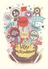
Prize Winning Pies
James Hancock typography piece


experiments made with acrylic paints 

for these images with painted onto our hands with acrylic paint
and positioned our hands in a way to create a letter. 


I tried to manipulate some of the techniques Haworth and Hancock used to create similar types of texts. I also tried to experiment and create some texts of my own. My work is similar to the artist as I tried to do popular text like 'Arial'. My work is also different from the artist as there's was done on computer which gives it a much cleaner finish. With handmade typography if you make a mistake, you have to work with where as using Photoshop like the artist have you can erase any mistake you have made. Working with ink was really easy and allowed me to be free with experimentation. Whereas, working with the masking tape, sticking it onto the paper, when finally taking it off, the paper was coming away with the masking tape which is not what I wanted to happened. In the future I would use thicker paper like card of not stick down the masking tape completely down.