Thursday, 7 February 2013

Exam Unit- Illustration Brief - In depth Analysis - Quinten Jones


Quinten Jones is a model, illustrator and film maker and also a philosophy graduate at Cambridge. Afterwards she went to London central St. Martins to home her illustration. She has then made films for the fashion world, Chanel and Victoria Beckham. 

                                                                                                                                                                                                                                                                                                     
"When I started illustration, I knew I wouldn't be successful with the sort of fragile colouring pencil illustration that was popular at the time, so I went my own way and tore paper and loosely slapped down paint. I guess philosophy is similarly about creating your own solution in the face of more established ones. Both are about problem solving." -http://fashion.telegraph.co.uk/news-features/TMG9698406/Whos-that-girl-Quentin-Jones.html


The use of composition is very usual putting random things upon one another to create an unsual shape. I think this piece was made by a mixture of handmade and digital techniques. I think that the pattern was draw and then scanned into the computer and that the hand and cat could be photographs. Then have then been put into photoshop and arranged around the models head. This artist has used interesting use of colour, only keeping colour in the lips. Is there a reason for this? I think the random use of objects makes the art work very abstract and modern and gives quite a lot of humor to the piece. Having pattern in there I think gives the image texture and layers.

This type of art work is abstract illustration. I think the artist was trying to be experimental and putting different things together that you wouldn't see in order to see the outcome and see how it would turn out. There's a model involved pulling a funny face and then other pieces have been added on through the computer.

When I first saw this work I would say that is was unusual to me and I had to think about whether I really liked it or not. Still I do not know whether I like it as I don't really get it. I prefer work that I can relate to and has depth of meaning init. With this piece, I've found it hard to guess whether it means something, is it symbolic? why has she only put in one colour on a selective area?


Exam Unit - Chosen Brief


For my chosen brief I have decided to chose the illustration brief. The reason why I have chosen this brief as I think illustration is one of my weaknesses and I could use this brief to improve this. It also different from the typography brief which I have already done before and feel if I chose this brief it wouldn't be as interesting as the rest. 

Sunday, 3 February 2013

Magazine Project - Evaluation


 For this project we had to create a magazine. Before doing this we had to research other magazine and look at how the worked with layouts, materials,colours,text,images. By looking at other artist and magazine this have us our own ideas to use to create our own. 
 When i found out i could do a spread on books I automatically thought about doing a spread on my favour book twilight. I then wanted to make the theme was in your face even right down to the text and colours. I drew out a couple of practice designs in my sketchbook to see what worked best but when I came up with my favourite one is when I developed this into Photoshop and became a spread in my magazine. 
I think that Henrick Bonnvier inspired my work with the use of bold colours. I wanted a magazine that was eye catching and wanted to make you interested into reading and looking inside. Other inspirations came from the theme I choose. e.g. twilight book/look, converses. 
 I am really happy with my illustrations spread and magazine as I feel that they look like real magazines spread. I think they are clear and easy to read, the layout is perfect unlike my photography spread with one of the pages has gone to the other one. I think that if I put more time in, that the whole magazine could be improved and at a better standard. 
 I think that I could have improved my outcome that having a set theme throughout the whole magazine, I feel that it a bit jumbled and none of the pages really relate. I also think that with more research I could of made the front/back pages more realistic to other magazines. 
 During this project I enjoyed learning new techniques on Photoshop and developing my skills in that area further. In my opinion I preferred the Typography project more and there was more handmade practical work but overall this was a ok project and another learning journey with an interesting final outcome.


Thursday, 24 January 2013

Magazine Project - Magazine Spread


 Here are the book covers of twilight that I have taken images of and then gone into Photoshop and edited them with Photoshop changing the colours and brightness and contrast. I wanted to really enhance the colour such as the red and white.
 I then put the covers into Photoshop and drew out circles around them, I then created clipping masks, flattened the image and dragged and dropped into another image. I really liked the idea of not using squares like the book cover but taking small circle of the books.

As you can see the original image had people in it, to make this image more effective for me i removed them people inside by using the alone stamp tool (+alt) along with smudge in Photoshop to remove the people. 


I then took my own image to recreate the scene of forks. In the book it is described as dark and gloomy so I wanted to de saturate the the colour but not completely taking it out. This really gave it a mystical vibe. 

This is my final design of a two page spread. I really like my final outcome as it has the themes of twilight using the same text and continuing with the same colours as a theme.

Friday, 11 January 2013

Magazine Project - Photography Spread


For my photography page i wanted to use a silver background
to make it more sleek and professional relating back to the photography theme.
 I also installed a font called '1942 Report'.
I put in the images related to the artist. 

I like end outcome and I really like the font. If I had more time I would have liked to
have taken my own images and put into my own. 

Thursday, 10 January 2013

Magazine Project - Mood board


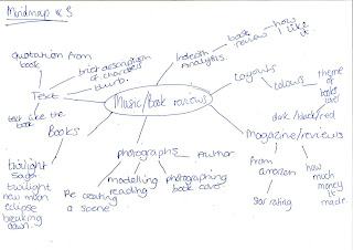
Here is the mood board I've created this project. My chosen theme that I have used is the book theme and I am using the book twilight by stephanie meyer. I've want to use the similar colours and the same text in my article to almost replicate the book. The images I want to use will be from some of the scene from the book and the text will be one text from the book taken off the internet and some of my favourite quote clipped into the article. 
1.http://www.google.co.uk/imgres?q=twilight&start=269&um=1&hl=en&safe=active&sa=N&tbo=d&biw=1024&bih=873&tbm=isch&tbnid=BqRlM7iWK_Lx8M:&imgrefurl=http://www.bookcollections.co.uk/offers/twilight-saga-box-set.php&docid=mgQIFWjSFbHucM&imgurl=http://www.bookcollections.co.uk/i/Twilight%252520Book%2525201.jpg&w=300&h=300&ei=ftfuUMbDIcKc0AWvr4G4CQ&zoom=1&iact=hc&vpx=96&vpy=376&dur=412&hovh=225&hovw=225&tx=107&ty=111&sig=103064491499132835329&page=9&tbnh=155&tbnw=155&ndsp=33&ved=1t:429,r:97,s:200,i:295
2. downloads ''vampire'' text of dafont.com and installed onto photoshop
3. colours I want to use related to my theme of the book, main colours used are black and red.
4. twilight blurb. may include into my spread.http://www.google.co.uk/imgres?q=twilight+book+blurb&um=1&hl=en&safe=active&tbo=d&biw=1024&bih=873&tbm=isch&tbnid=56CrpkAYkYKcnM:&imgrefurl=http://theblackpooltower.blogspot.com/2010/06/power-of-blurb.html&docid=SDlFS07iJvhkaM&imgurl=https://blogger.googleusercontent.com/img/b/R29vZ2xl/AVvXsEigIHMaca9A7XPIjODVIlqQKgmJ41hb_raFA3LSDFjeOuAIIWkoUBtSRbacHCc07licv85rd2U1S7lTHkNs3SIlzozo9mcxN_k-ITYSkrT1JtIVnpGegOsvSJZ4pwPsEwZfyBIICuP2mSE/s1600/twilight.jpg&w=1021&h=1600&ei=N-DuUPn4I6OA0AXHj4GgDw&zoom=1&iact=rc&dur=385&sig=108419556140272734563&page=1&tbnh=155&tbnw=101&start=0&ndsp=32&ved=1t:429,r:0,s:0,i:78&tx=75&ty=60
5. a specific quote from the book that I like.
6.from the twilight film. want to take this image and and photograph my own scenery
7. mention other books, google images