Thursday, 9 May 2013
Exam Unit- Exam Review
Sunday, 17 March 2013
Exam Unit - Independent Research - Raphael Vicenzi


This art work is produced by a man called Raphael Vicenzi. He's from Brussels in Belgium. It came across this artist on the College's blog and straight away I knew that I wanted to do something similar to this. I liked the different use of techniques of illustration, colour, ink, paint splatters, text and the collage effect.I also liked his composition of randomly illustrations that remind you of doodles. I think this work well with my illustration brief. I think by trying the same similar technique I can can improve my own skills, (combining handmade techniques and digital ones.) After looking at this artist work it was inspired me for my own with a free experimental attitude and looking forward to the end outcome.
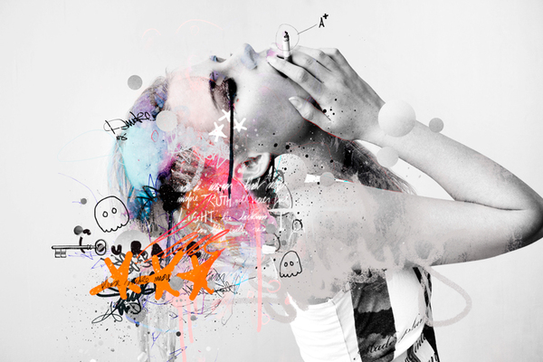
Exam Unit - Mowgli Omari

Mowgli Omari is a 21 year old University student who is currently residing in South East London.
This collage is of two images put together where one has been put on top which has been cut into to make a form of a shape and then the two images placed together then create a collage. I think the process of making this image consisted of the artist drawing a shape on the back of the image using a pencil and ruler and then carefully cutting it out using a craft knife and a cutting board cutting out his shape. Then glue/stick the two images together.
It looks like for this image the top one is colour and the one at the bottom is black and white. By doing this really brings out the contrast of the two and makes the collage more effective. By using the straight diagonal lines makes the image more visually interesting. It also the image movement. Through the space gives it a illusion effect and distortion where we can't really make out what he image is. I think this can be a really good thing as by not instantly seeing what the image is, you would spend more time looking at it and therefore would thinking about it more and could decide whether you liked it or not.
I would say this genre of work would come under abstract but also I think photography. This image looks like two people are running away from something. It also looks like it could be quite a poor area from the background what you can make out of it. I think that maybe these people could have been in trouble, could have committed a crime or they could be victims themselves. The distortion of the image could be symbolic to the subject, we are confused about whats happening and the models could be confused.
This piece definitely evokes visual senses. I found it quite exciting and didn't know where to look. I like this when looking at art. First word that comes to my head was lines and shapes. It was very straight and sharp. It reminded me of a technique I have previously used - photo weaving. This has similar technique of cutting out patterns and lines but rather sticking your images together you weave them together.I like this image as I find it interesting. It also draws to me again as it is a handmade technique. I like the designed lines and shape and the outcome of it. I also enjoyed trying to make out what the image was.
Friday, 1 March 2013
Exam Unit- Illustrations - Andy Warhol
 |
| Original collage scanned in |
 |
| Original collage scanned in |
 |
| Edited in Photoshop, enhancement of colours |
 |
| Combination of the two images together, lowered the opacity of one layer |
 |
| Edited in photo shop and enhanced the colours and also used the posterize effect |
These experiments were inspired by an artist called Andy Warhol. The experiment consists of taking an image of yourself and putting it into photo shop. When you have done this you need to take the saturation out of your image to make it black and white. You then turn the contrast up. After you have done this, you then need to go into Image > Adjustments > Threshold. When you have this effect you print onto tracing paper. On another piece of paper create a simple collage using different materials and colours such as different types of papers. Place your tracing paper over your collage and start to draw into your tracing paper.
I really enjoyed this experiment as I thought you could be very free with it and exciting to not know what the outcome was going to look like. I much rather prefer handmade experiments to digital anyway. I though with these experiments I could put them into Photoshop and see if I could enhance them even more which I did and I'm very impressed with the outcome. This experiment has inspired me to use the same layering technique again and maybe incorporate this into my exam outcome.
Thursday, 7 February 2013
Exam Unit- Illustration Brief - In depth Analysis - Quinten Jones

Quinten Jones is a model, illustrator and film maker and also a philosophy graduate at Cambridge. Afterwards she went to London central St. Martins to home her illustration. She has then made films for the fashion world, Chanel and Victoria Beckham.
The use of composition is very usual putting random things upon one another to create an unsual shape. I think this piece was made by a mixture of handmade and digital techniques. I think that the pattern was draw and then scanned into the computer and that the hand and cat could be photographs. Then have then been put into photoshop and arranged around the models head. This artist has used interesting use of colour, only keeping colour in the lips. Is there a reason for this? I think the random use of objects makes the art work very abstract and modern and gives quite a lot of humor to the piece. Having pattern in there I think gives the image texture and layers.
This type of art work is abstract illustration. I think the artist was trying to be experimental and putting different things together that you wouldn't see in order to see the outcome and see how it would turn out. There's a model involved pulling a funny face and then other pieces have been added on through the computer.
When I first saw this work I would say that is was unusual to me and I had to think about whether I really liked it or not. Still I do not know whether I like it as I don't really get it. I prefer work that I can relate to and has depth of meaning init. With this piece, I've found it hard to guess whether it means something, is it symbolic? why has she only put in one colour on a selective area?
Exam Unit - Chosen Brief

For my chosen brief I have decided to chose the illustration brief. The reason why I have chosen this brief as I think illustration is one of my weaknesses and I could use this brief to improve this. It also different from the typography brief which I have already done before and feel if I chose this brief it wouldn't be as interesting as the rest.
Sunday, 3 February 2013
Magazine Project - Evaluation

.JPG)
.JPG)
.JPG)
.JPG)
For this project we had to create a magazine. Before doing this we had to research other magazine and look at how the worked with layouts, materials,colours,text,images. By looking at other artist and magazine this have us our own ideas to use to create our own.
When i found out i could do a spread on books I automatically thought about doing a spread on my favour book twilight. I then wanted to make the theme was in your face even right down to the text and colours. I drew out a couple of practice designs in my sketchbook to see what worked best but when I came up with my favourite one is when I developed this into Photoshop and became a spread in my magazine.
I think that Henrick Bonnvier inspired my work with the use of bold colours. I wanted a magazine that was eye catching and wanted to make you interested into reading and looking inside. Other inspirations came from the theme I choose. e.g. twilight book/look, converses.
I am really happy with my illustrations spread and magazine as I feel that they look like real magazines spread. I think they are clear and easy to read, the layout is perfect unlike my photography spread with one of the pages has gone to the other one. I think that if I put more time in, that the whole magazine could be improved and at a better standard.
I think that I could have improved my outcome that having a set theme throughout the whole magazine, I feel that it a bit jumbled and none of the pages really relate. I also think that with more research I could of made the front/back pages more realistic to other magazines.
During this project I enjoyed learning new techniques on Photoshop and developing my skills in that area further. In my opinion I preferred the Typography project more and there was more handmade practical work but overall this was a ok project and another learning journey with an interesting final outcome.
Subscribe to:
Posts (Atom)