Thursday 9 May 2013

Exam Unit - Evaluation Of Prep Work


For the exam theme I interpreted it as hidden, so I wanted to make my final outcome have certain parts missing and covered. Also looking at theme I thought of weird and a bit unusual. Thinking outside the box and what could I create that I haven't done before. I explored many different experiments that I haven't used before. For example exquisite corpse
For my final, I am using masking fluid to cover certain parts of my illustrations and enhance other parts. I am also using my Andy Warhol experiments which I use different material such as tissue paper, card, tracing paper to hide different parts of the image.Then photocopying these illustrations onto different papers and creating a zine, on this zine I will have text  and will be cutting out certain words and cutting out certain parts of my illustrations in order to my the outcome obscured. 
I looked at exquisite corpses and didn't like them very much so did not develop them further. I also looked at michelle thomspson and her use of collage but did not develop these further as these weren't my desired outcomes. 
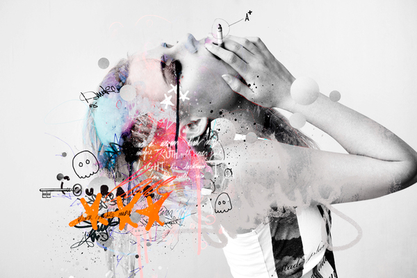
My ideas have now changed where my illustrations will be andy warhol/raphael vicenzi inspired onto my zine. My raphael vicenzi inspired illustration I have slightly develop and will use masking fluid along side water colours to make this more interesting. Masking fluid to secure any places on your paper you want to keep white once your go over you image with watercolour. After this has dried you then rub off the masking fluid to retrieve the white. I think that this experiment works really well which is why I am choosing todo this in my final. I have used many materials such as different coloured card and papers to see how this changes the original experiment. I have used different techniques such as collage and different types of illustration. I used the collage technique and masking fluid to develop and realised that this idea was the best and the one to persue for the exam. I have has to adapt my experiments into put them into photoshop and enhance the colours and I want them brighter and bolder than the colours that I have. The main people that have influenced me are michellle thompson with her use of positioning her collages, andy warhol with his threshold effect of portraits and raphael vicenzi with his sketchy illustrations. All together they have inspired and influenced my final piece.For my final piece I intend to make a complex zine including text and paper cutting to make it more dynamic. I intend of using my new learnt techniques such as masking fluid printed onto different material such as brown paper to form my zine. Overall, I think that exam has been challenging as the theme wasn't something that I liked the look of, I then had to work around it and find ways I could make it exciting for me. By using handmade technique, which I prefer doing than digital made it more fun to me and I was able to make this work for my final. I pushed myself into illustration as I knew this is my weak spot knowing I could push myself further. By doing all the experiments through the projects I have learnt to enjoy the exam project and will be very happy with my outcome. 


Exam Unit - Indepth Analysis - Andy Warhol


This piece of art work is from an artist called Andy Warhol . Andy Warhol was born August 6, 1928 and died February 22, 1987. He was an american artist who was known for his pop art. He studied at the University of Pittsburgh in the education of art. This is art abstract illustration effect. I have chosen to analyse this piece because I haven look at Warhol's style before and made similar work and now want to progress this further so have decided to research him..
This piece of work I have chosen is of a women, the red background behind her emphasising her face central to the image. I think that the red could be representing the women as sexy and feminine.
This image was originally a photograph that has been edited in Photoshop with the Threshold effect, then the colours have also been put in to place. The colours used are very limited but bright and bold in your face which makes it visually exciting to look at. I think that the lines in the piece are very important. The wrist had used the lines along with the colour to crate this pop art effect. I really like the way colour overlap the strong black like on top of them.
I chosen to look at this work because I have made work inspired by this artist. I really enjoying looking at this person work and decided to research them in order to develop my knowledge further. When i first saw his work I thought of different characters, alter ego's. celebrities, people that are constantly put in front of us. I really like this work as I enjoyed looking at the photography and the way the colour really enhance this more. This work has inspired me to be bigger and bolder, Using brighter colour to get you work notice and really brings out the photograph even more.

Exam Unit- Exam Review


My three initial ideas were to create a collage drawing and illustration onto of them then made into zines, this was inspired by michelle thompson, as I really liked her idea. My second idea was doing illustrations with waiter colour and finer liner like raphael vicenzi, I really liked this abstract effect and the why his image are put together and the outcome look sketchy. My last idea was to create my zine like an exquisite corpse. This way I could use my own primary photographs and sample them in the work. To create my zine I want varied material such different textural papers; coloured card, tracing paper, graph paper and brown paper. Then using different materials such as magazine cut outs, photographs and water colours to create my illustrations. I have tried to explore a range of different techniques such as masking fluid, complex collage making, creating and practicing different zines. I wanted to widen my range of techniques before the exam so I could perform my best techniques on the day. I also tried to refine and develop my experiments by scanning them into Photoshop and manipulating the colours around. Flattening the image on the photocopier and then inverting it making it get a 'negative effect'. I also went back to old experiments, such as ''Andy Warhol '' and added onto them, playing around with scale, changing around the materials, trying to make it much more visually interesting. Throughout my sketchbook, I have detailed annotations along side each experiment, giving brief description of he artist used. I've found that by doing this and going into more research into the artist made me really interested in the artist work and made me want to do more work like them. It has also helped me find future technique that I wanted to create. I think my Andy Warhol experiments have been the best as I felt that they came out the best. I would like to do more of these in the future. The experiment that has been he least successful would probably be the exquisite corpse one as it didn't interest me that much, I didn't really understand it and didn't particularly like the outcome. For my final outcome I will be choosing Andy Warhol inspired experiment as I think these have worked the best and would really well as a zine. To develop this idea more I could try layering up the images, choosing different scales, turn them different ways, changing around the idea in order to improve the original ones. 


Sunday 17 March 2013

Exam Unit - Independent Research - Raphael Vicenzi


This art work is produced by a man called Raphael Vicenzi. He's from Brussels in Belgium. It came across this artist on the College's blog and straight away I knew that I wanted to do something similar to this. I liked the different use of techniques of illustration, colour, ink, paint splatters, text and the collage effect.I also liked his composition of randomly illustrations that remind you of doodles. I think this work well with my illustration brief. I think by trying the same similar technique I can can improve my own skills, (combining handmade techniques and digital ones.) After looking at this artist work it was inspired me for my own with a free experimental attitude and looking forward to the end outcome.

Exam Unit - Mowgli Omari


Mowgli Omari is a 21 year old University student who is currently residing in South East London.

This collage is of two images put together where one has been put on top which has been cut into to make a form of a shape and then the two images placed together then create a collage. I think the process of making this image consisted of the artist drawing a shape on the back of the image using a pencil and ruler and then carefully cutting it out using a craft knife and a cutting board cutting out his shape. Then glue/stick the two images together.

 It looks like for this image the top one is colour and the one at the bottom is black and white. By doing this really brings out the contrast of the two and makes the collage more effective. By using the straight diagonal lines makes the image more visually interesting. It also the image movement. Through the space gives it a illusion effect and distortion where we can't really make out what he image is. I think this can be a really good thing as by not instantly seeing what the image is, you would spend more time looking at it and therefore would thinking about it more and could decide whether you liked it or not.

I would say this genre of work would come under abstract but also I think photography. This image looks like two people are running away from something. It also looks like it could be quite a poor area from the background what you can make out of it. I think that maybe these people could have been in trouble, could have committed a crime or they could be victims themselves. The distortion of the image could be symbolic to the subject, we are confused about whats happening and the models could be confused.

This piece definitely evokes visual senses. I found it quite exciting and didn't know where to look. I like this when looking at art. First word that comes to my head was lines and shapes. It was very straight and sharp. It reminded me of a technique I have previously used - photo weaving. This has similar technique of cutting out patterns and lines but rather sticking your images together you weave them together.I like this image as I find it interesting. It also draws to me again as it is a handmade technique. I like the designed lines and shape and the outcome of it. I also enjoyed trying to make out what the image was. 

Friday 1 March 2013

Exam Unit- Illustrations - Andy Warhol


Original collage scanned in
Edited in Photoshop, enhancement of colours


Combination of the two images together, lowered the opacity  of one layer
Edited in photo shop and enhanced the colours and also used the posterize effect
These experiments were inspired by an artist called Andy Warhol. The experiment consists of taking an image of yourself and putting it into photo shop. When you have done this you need to take the saturation out of your image to make it black and white. You then turn the contrast up. After you have done this, you then need to go into Image > Adjustments > Threshold. When you have this effect you print onto tracing paper. On another piece of paper create a simple collage using different materials and colours such as different types of papers. Place your tracing paper over your collage and start to draw into your tracing paper.

I really enjoyed this experiment as I thought you could be very free with it and exciting to not know what the outcome was going to look like. I much rather prefer handmade experiments to digital anyway. I though with these experiments I could put them into Photoshop and see if I could enhance them even more which I did  and I'm very impressed with the outcome. This experiment has inspired me to use the same layering technique again and maybe incorporate this into my exam outcome.

Thursday 7 February 2013

Exam Unit- Illustration Brief - In depth Analysis - Quinten Jones


Quinten Jones is a model, illustrator and film maker and also a philosophy graduate at Cambridge. Afterwards she went to London central St. Martins to home her illustration. She has then made films for the fashion world, Chanel and Victoria Beckham. 

                                                                                                                                                                                                                                                                                                     
"When I started illustration, I knew I wouldn't be successful with the sort of fragile colouring pencil illustration that was popular at the time, so I went my own way and tore paper and loosely slapped down paint. I guess philosophy is similarly about creating your own solution in the face of more established ones. Both are about problem solving." -http://fashion.telegraph.co.uk/news-features/TMG9698406/Whos-that-girl-Quentin-Jones.html


The use of composition is very usual putting random things upon one another to create an unsual shape. I think this piece was made by a mixture of handmade and digital techniques. I think that the pattern was draw and then scanned into the computer and that the hand and cat could be photographs. Then have then been put into photoshop and arranged around the models head. This artist has used interesting use of colour, only keeping colour in the lips. Is there a reason for this? I think the random use of objects makes the art work very abstract and modern and gives quite a lot of humor to the piece. Having pattern in there I think gives the image texture and layers.

This type of art work is abstract illustration. I think the artist was trying to be experimental and putting different things together that you wouldn't see in order to see the outcome and see how it would turn out. There's a model involved pulling a funny face and then other pieces have been added on through the computer.

When I first saw this work I would say that is was unusual to me and I had to think about whether I really liked it or not. Still I do not know whether I like it as I don't really get it. I prefer work that I can relate to and has depth of meaning init. With this piece, I've found it hard to guess whether it means something, is it symbolic? why has she only put in one colour on a selective area?