1) http://www.google.co.uk/imgres?num=10&hl=en&tbo=d&biw=1280&bih=665&tbm=isch&tbnid=xDWOgxO1iH_QfM:&imgrefurl=http://www.glogster.com/1jbfan/favorite-converse-colors/g-6n6jq7clmqlqeo95e6eehdh&docid=VWwpYAZdr8nUmM&imgurl=http://4e7221.medialib.glogster.com/media/da3df532df5fffc371ff755593ff230c6c1cd75081b4c09269a4f7cd440b313a/rrrrrrrrrred-converses.jpg&w=300&h=300&ei=davJUMfVDs6A0AXZ04DICw&zoom=1&iact=hc&vpx=812&vpy=61&dur=390&hovh=147&hovw=170&tx=167&ty=137&sig=106106764840616349529&page=2&tbnh=144&tbnw=168&start=22&ndsp=29&ved=1t:429,r:41,s:0,i:277
2) http://www.google.co.uk/imgres?num=10&hl=en&tbo=d&biw=1280&bih=665&tbm=isch&tbnid=qneYC4fBbCDYnM:&imgrefurl=http://www.thisnext.com/browse/drips/&docid=xSYrDY6VBbJkDM&imgurl=http://s7.thisnext.com/media/largest_dimension/ACC68B8A.jpg&w=431&h=431&ei=NazJUO_9MrDJ0AXVwoCYDg&zoom=1&iact=rc&dur=598&sig=106106764840616349529&sqi=2&page=1&tbnh=139&tbnw=134&start=0&ndsp=27&ved=1t:429,r:5,s:0,i:95&tx=56&ty=70
3)http://www.google.co.uk/imgres?start=58&num=10&hl=en&tbo=d&biw=1280&bih=665&tbm=isch&tbnid=kkMjG3yjnSxR1M:&imgrefurl=http://flickrhivemind.net/User/Rob%2520Carey2/Interesting&docid=KOrtSkCtyDxMMM&imgurl=http://farm5.static.flickr.com/4152/5198927462_d0983e8aa0.jpg&w=500&h=361&ei=qazJUI3vGKmY0QWi6YGoCQ&zoom=1&iact=hc&vpx=971&vpy=134&dur=1880&hovh=191&hovw=264&tx=171&ty=129&sig=106106764840616349529&sqi=2&page=3&tbnh=142&tbnw=239&ndsp=26&ved=1t:429,r:70,s:0,i:154
4) http://matthewmidgley.wordpress.com/
5) https://www.google.co.uk/search?num=10&hl=en&site=imghp&tbm=isch&source=hp&biw=1280&bih=665&q=converses&oq=converses&gs_l=img.3..0l10.3267.4896.0.6272.9.8.0.1.1.0.130.635.7j1.8.0...0.0...1ac.1.bxmhSr8cg7A#hl=en&tbo=d&site=imghp&tbm=isch&sa=1&q=spray+paint+effect+&oq=spray+paint+effect+&gs_l=img.3..0l2j0i24l8.3980.50762.6.51063.22.17.1.4.4.0.93.1228.17.17.0...0.0...1c.1.5y7kRJede5k&pbx=1&bav=on.2,or.r_gc.r_pw.r_qf.&bvm=bv.1355272958,d.d2k&fp=b2fbde3f17000349&bpcl=39942515&biw=1280&bih=665
6) http://www.tumblr.com/tagged/white-converse
7)http://www.google.co.uk/imgres?num=10&hl=en&tbo=d&biw=1280&bih=665&tbm=isch&tbnid=WWjIWbH4BH0ltM:&imgrefurl=http://www.pantherinteriors.co.uk/blog/index.php/tag/office-colour-scheme/&docid=_tgN2W7rQYTdbM&imgurl=http://www.pantherinteriors.co.uk/blog/wp-content/uploads/2011/08/colour-scheme.jpg&w=500&h=400&ei=cK3JUMvQDsLG0QW154GYCg&zoom=1&iact=rc&dur=364&sig=106106764840616349529&page=3&tbnh=149&tbnw=186&start=48&ndsp=34&ved=1t:429,r:76,s:0,i:382&tx=100&ty=83
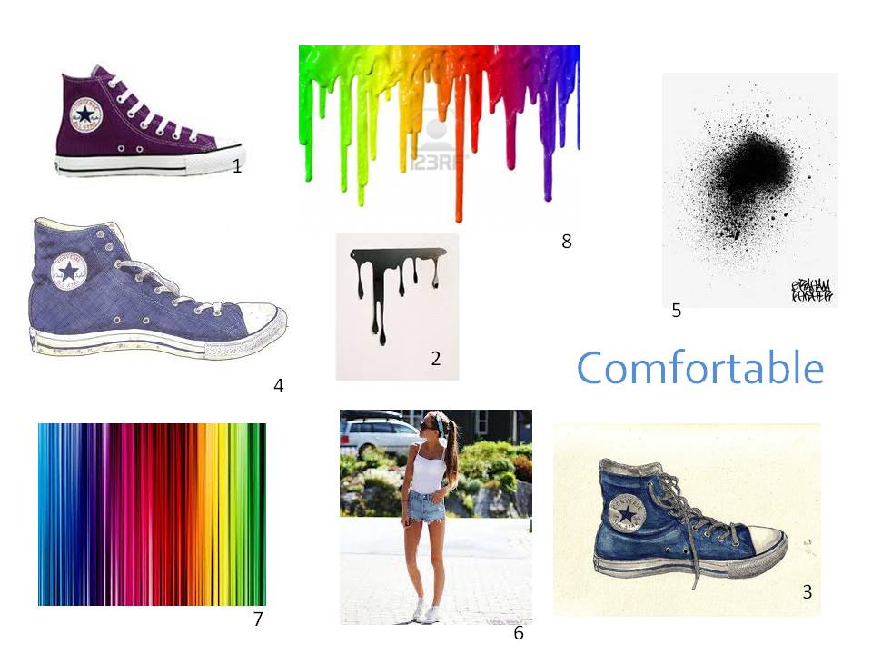
8) http://www.google.co.uk/imgres?um=1&hl=en&client=firefox-a&hs=oBS&tbo=d&rls=org.mozilla:en-US:official&channel=fflb&biw=1280&bih=665&tbm=isch&tbnid=dZHmG9AsFMpWbM:&imgrefurl=http://www.123rf.com/photo_9343655_different-colors-of-paint-dripping.html&docid=L9vFfpAPHzRknM&imgurl=http://us.123rf.com/400wm/400/400/ssilver/ssilver1104/ssilver110400055/9343655-different-colors-of-paint-dripping.jpg&w=1200&h=801&ei=PbDJUPrCDsim0AXKmYHoBw&zoom=1&iact=rc&dur=475&sig=106106764840616349529&page=1&tbnh=144&tbnw=216&start=0&ndsp=31&ved=1t:429,r:4,s:0,i:92&tx=56&ty=37
Thursday, 13 December 2012
Magazine Project - Indepth Analysis - Andrea Bricco & Henrik Bonnever
Andrea Bricco
|
![]() |
| Andrea Bricco |
![]() |
| Andrea Bricco |
![]() |
| Henrick Bonnevier |
![]() |
| Henrick Bonnevier |
Andrea Bricco:
From research, it shows that Bricco family have a restaurant, showing the inspiration with food. She grew up in Wisconsin USA.She's been used in many magazines and cook books with advertisment in the food industry.
Alot of her work is around food, playing around the composition to create other objects.
The objects and been designed with a variation of food objects and food illustrations. I think the illustrations are there to clarify what the object is meant to represent. Also with focus of lighting with the shadow coming from above to enhance the image.
When you look at these images it introduces all your sense, touch, smell, taste etc. Therefore, making it all the more exciting. As soon as you see the image it's visually attracting therefore enticing you to look through more and understand the images more and find out what there about, why she made them and how.
I this work reminds me of Natsko Seki's work in a sense of the way they have both created a scene with images just Bricco had a set theme of food. I like the way also that Bricco has used illustrations, to make it easier to understand the images.
Henrick Bonnevier:
As you can see from the images the artist is in advertisement. He's been in vogue magazine.
He's overall theme is fashion working with bright bold colours to entice people to buy the products.
All his images are landscape. His works intention is make his objects look their best against other objects that compliment each other in order to persuade people to buy. He uses colour boldly to make the final product striking. The overall composition looks randomly designed with shows there was thought behind the design to make the bigger objects more visible. The colours are also limited, using only two colours three maximum. I like this artist work because it's so colourful, it's making it exciting and giving it an uplifting mood. But become too busy and overwhelming. It reminds me of the inside of a shop window. I would like to do work like this in the future.
Friday, 23 November 2012
Indepth Analysis - Georgia Luck, Natsko Seki & Matthew Midgley
![]() |
| example of Natsko Seki |
![]() |
| example of Natsko Seki |
![]() |
| example of Matthew Midgley |
![]() |
| example of Matthew Midgley |
![]() |
| example of Georgia Luck |
![]() |
| example of Georgia Luck |
Another artists we looked at was Matthew Medgley. He uses fineliner and watercolour. I like the object he draw images of - ordinary everyday things. He designs seem simple but well compositioned. i like his use of line and colours.
Lastly, we looked at Georgina Luck illustrations. She a freelance illustrator who lives in Brighton.She studied at Bristol school of Arts graduated 2006.Some of her clinets include; Marks and Spencer, TESCO, Gatwick Airport and Saatchi & Saatchi. I think her works theme relates to advertisement of products through the bright colours.
I like the way she draws the object exactly how she sees them. There are not been exaggerated in any way.She takes detail in her lines and combines them with mark making. as result making the objects lookShe look flowing. It looks as though she uses fine liner, watercolour and ink. She combines these materials with her techniques of sketchy lines to create and cartoon effect.
I think all these artist relate to eachother through the use of lines. i think that they have a similar technique of illistrating their technique. Natsko Seki is different from the other two as she uses paper cutting.
Overall, Georgina Luck was my favourite illustrator to look at as I liked her images. I like the way the ink splatters bled away from the object to make it look quite abstract. I will take these techniques with me to practice lines drawings in the future with still life drawing.
Thursday, 22 November 2012
Georgina Luck Inspired Drawings
![]() |
| Georgina Luck example 30 second drawings using fine liner and pencil |
![]() |
| 30 second drawings using fine liner and colour pencils |
![]() |
| 30 second drawings using fine liner and colour pencils |
![]() |
| 1 minute drawing using pencils and ink |
![]() |
| 1 minutes drawings using water colour and fine liner |
![]() |
| 5 minute drawing using ink and fine liner |
Tuesday, 20 November 2012
Final Outcome and Evaluation
| My Final Outcome T-Shirt Design. |
For this project, we had to learned a variety of techniques to then put together our own final t-shirt design and print this for our final outcome, we came up with the ideas by looking at artist like Si Scott, M&M Paris and Natsuki Otani. After looking at these we went on to develop our techniques into our own designs.I realised from the beginning that I preferred the handmade techniques rather than the digital ones as I could control the outcome. throughout my journey on the project I tried to improve my digital skills in order to complete the tasks. Eventually, I was starting to get my head around using the different tools and what there functions were. I like the clean finish the digital experiments were create and was beginning to prefer them more. I then began to think about what sort of final outcome I wanted. I wanted to combine both handmade and digital experiments together.
I think that the watercolour experiment inspired me the most which influenced my final outcome. I like the blending of colours that I was able to do. Her design inspired me to create my own but create a slightly different outcome by changing the material from watercolour to spray paint.
I decided to use a little quote that I recently came across over the internet. 'Don't cry because it ended. Smile because it happened'. I like this quote because I thought it had a positive meaning behind it and encourages us to be optimistic about endings. I tried to use quite bright colours of red,pink and white - I also thought these colours worked particularly well when blended.
I think my design worked out well because I choose a bold text 'Impact' which show my text at it's best. I would hard and quick to cut out my stencil and went straight onto spray painting it. I wanted where the stencil had been to stay white to act as a frame around the text. I thought this particularly worked well. I am very happy with my final outcome because it's exactly how I imagined it to turn out to be.
If I could of improved it I would have used different colour or done samples of different colours to see how they would turn and what worked best as I'm not sure that the colours that I used were the best colours.
Overall, I liked this project as I got a chance to learn different experiment around typography which has been something i have been interested in since last year. It also a subject I would like to corporate in the Photography work. Now I have learnt these technique I could incorporate these technique in future work.
Development Of Ideas - 3 Initial Ideas
![]() |
| done by hand, this is the idea I would like to use for my final outcome, creating a stencil, cut it out and use the spray paint to blend and create the water colour effect. |
![]() |
| This is my Si Scott inspired idea, using a black t-shirt. I would heat transfer this design on. |
![]() |
| This is my other design where I also wanted to use the watercolour idea but directly with the paint onto the t-shirt. I later realise this wouldn't be the best way. |
Sunday, 11 November 2012
Bleaching & Heat Transfer Method
![]() |
| Bleaching |
![]() |
| Heat Transfer |
To get the bleached effect you first have to create a stencil, you print whatever design you want on t-shirt and print it onto card. When you have done that you then cut out your design. You then prepare you bleach. Make sure you tape down you're design onto your t-shirt so it doesn't move and you're painting you're bleach on. You then start dabbing you're bleach on as you don't want to just paint it on and the bleach make leak through and you want. Once you have gone over you're design a couple times to make sure the design is covered you leave to dry.
My bleaching effect didn't work very well and the bleach didn't take very well to the t-shirt. Maybe because I needed stronger bleach. I really enjoyed this using this effect but if I was to use this technique I would get the strongest type of bleach I could get to try ensure the bleach would come through.
The second technique was heat transfer;
First you turn on the heat transfer as it need around ten minutes to heat up.Whilst this is heating you need to get your design onto heat transfer paper. We had the teacher helping us with this. Once this is done you peel your design off the paper, place it onto the now heated heater onto of your t-shirt, heat proof paper again over this, you then shut down the heat transfer for 20 seconds and then lift and you're design is now you're t-shirt.
I liked this design as I got a better result then I did with the bleach. One thing I would fault with this technique is printing your design onto the heat transfer paper you can loose essential detail and doesn't print as good as you may see it on the computer. If we use this technique for my final outcome I would spend more time printing my design on a better printer.
Subscribe to:
Posts (Atom)


